HandyHarris

Visual Identity

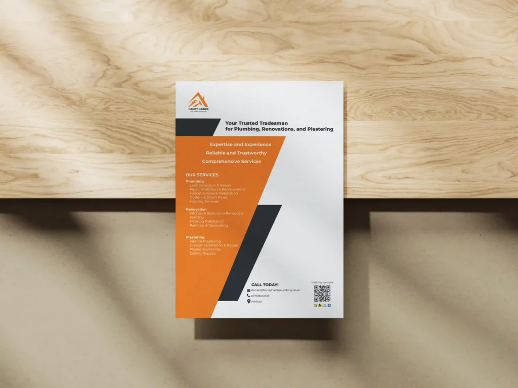
This branding project was developed for a local handyman starting his own business. The goal was to create a strong, clear, and approachable visual identity that could help him stand out in the market.
I worked as the solo designer, responsible for the entire visual development.I worked as the lead — and sole — designer, responsible for the entire visual direction and execution.

The main challenge was differentiation. In a market filled with similar services, the identity needed to feel trustworthy and professional, while also being eye-catching and accessible to a wide audience.

The initial scope included a logo, flyer, and business card. However, I expanded the work to include a broader brand identity system and foundational guidelines for future use — ensuring consistency as the business grows.

I created an illustrative logo that communicates the service clearly and quickly. The primary color — orange — was chosen to express the client’s energy and friendliness, while black anchors the design with a sense of professionalism and reliability. The use of vibrant color was intentional, drawing attention first, and then leading viewers to engage with the full message.


The brand system helped establish a distinct identity and generated curiosity and trust from potential customers. Handy Harris successfully attracted new clients and built a strong local reputation.

GET IN TOUCH