-1 Collective

Branding & Social Media Management

This project involved developing the full brand identity for -1 Collective, an electronic music collective. The scope included creating a complete visual and communication strategy, including branding guidelines, event promotion templates, and adaptable communication assets for both print and digital media.

I am the lead and solo graphic designer for this brand, as well as social media manager.

The photographs featured on this website were taken by the talented Andreia Ventura. You can view more of her work on her Portfolio or follow her on Instagram.

The electronic music scene is a highly saturated and visually competitive space. Our challenge was to craft a visual identity that felt truly unique; one that could distinguish -1 Collective from others while staying true to its underground ethos and energetic spirit.

We had to find a balance between minimalism and complexity: creating a system that worked across diverse, often psychedelic visuals, without losing clarity or recognizability. The brand had to be versatile for multiple formats, from digital event flyers to print materials, while remaining cohesive.

We began by building a word map to define the brand’s core personality: Minimal, Underground, and Uplifting.
While the first two were visually compatible, integrating the “uplifting” quality in a minimalist aesthetic was more complex and guided much of the visual experimentation.

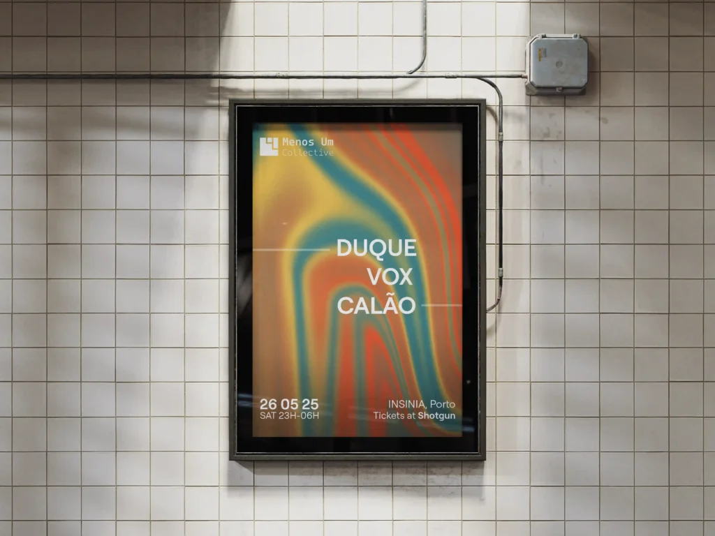
The logo was built around the concept of a descending staircase: a nod to the idea of being “underground,” both physically and culturally. It subtly incorporates a “-1” within a square grid structure, creating a bold, instantly recognizable symbol that functions well at any scale.

Typography was chosen for it’s clean, minimal lines, providing visual balance against rich, psychedelic backgrounds full of vibrant color. Layouts were designed for clarity, with a strong typographic hierarchy that gives prominence to featured artists and key event details.

The result was a striking and cohesive visual identity. The minimal, square-based logotype acts as a consistent brand signature, supported by vibrant color palettes and high-energy textures. This contrast creates a distinctive visual language that feels both modern and rooted in the underground electronic culture, reinforcing the importance of tension in design — the push and pull between simplicity and expression. 

The branding sparked curiosity and recognition from the audience. It enabled us to promote events across multiple formats while maintaining a coherent visual thread. We’ve seen increased engagement and a strong response from both attendees and collaborators.

Feel free to check their instagram for more: @menosum_collective

Coletivo -1

GET IN TOUCH